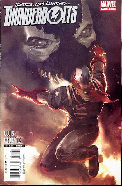
The high-contrast lighting, restricting the figures to grayscale and the garish-orange background create a memorable effect. There are Silver Age covers that I still recall as vividly as the day I bought them because of their distinctive color schemes.
Color scheme is an apt description. According to Djurdjevic "If it had been colored realistically, it would have been just another action piece, and that's something I shy away from."
Decades from now there will likely be comic enthusiasts remembering this cover just as fondly for the same reason.
THUNDERBOLTS #111 utilizes a classic comic cover layout, the threatening over-sized, floating villain head. This was Djurdjevic's second THUNDERBOLTS cover. The first was the obligatory editor-pleasing character montage.
A sketch of an alternate cover idea shows that he originally pondered having Venom's head floating between Bullseye and Radio-Active Man's heads. Selecting just Venom made it possible to draw him scary large. I first encountered Venom as an adult but I can see why younger fans are impressed by the character. It is amazing that Spider-Man EVER defeats him!


No comments:
Post a Comment